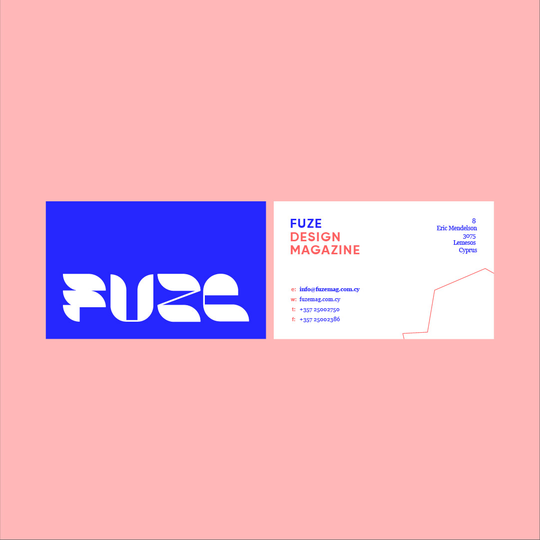
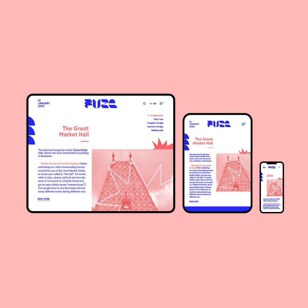
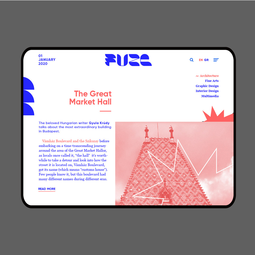
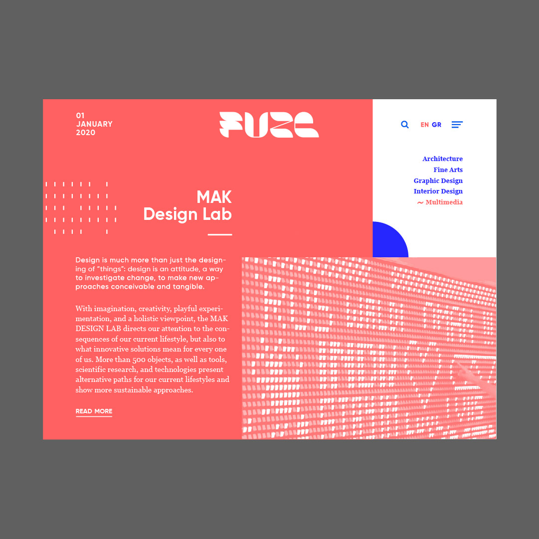
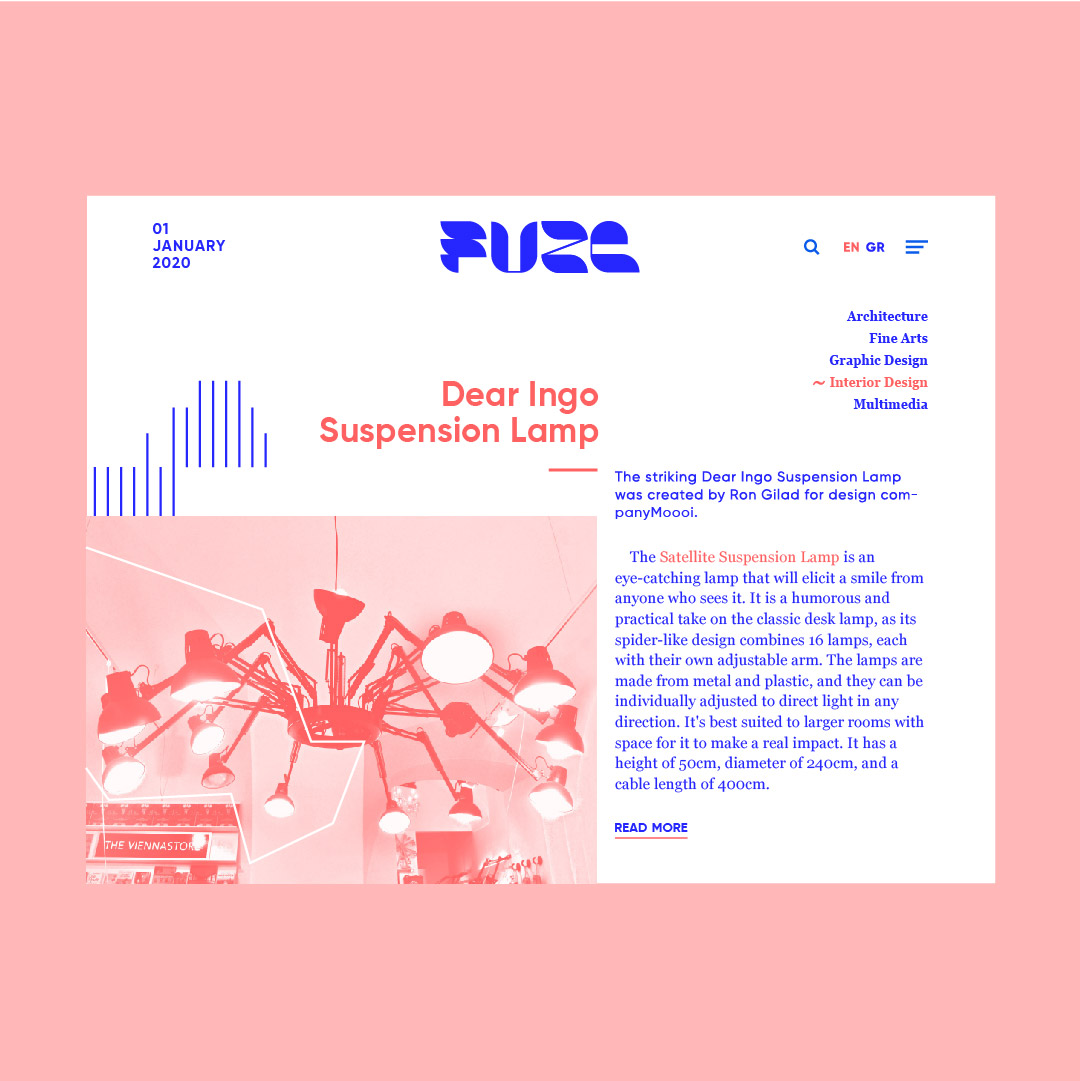
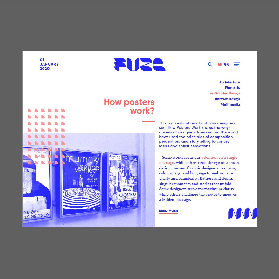
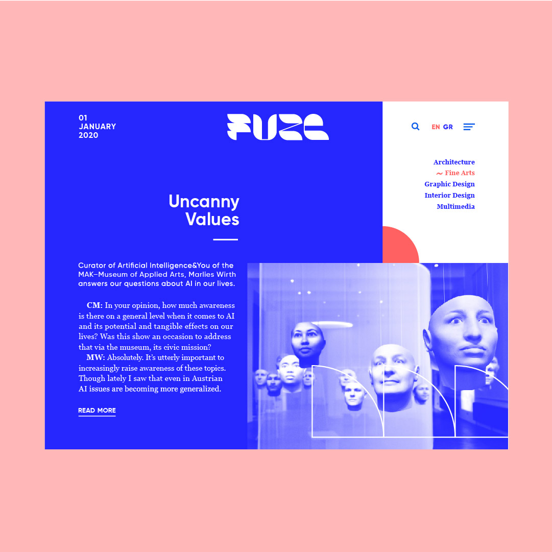
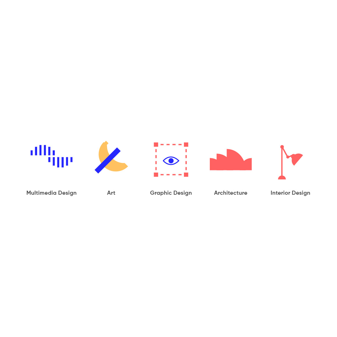
Fuze is a design magazine, focusing on young creatives and offering inspiration about graphic design, multimedia design, architecture, art and interior design. A fresh, modern, bright and bold logo was designed in order to be appealing, exciting and kinematic. The energy it has, is like the young readers’ energy for absorbing all the magazine’s creative information. The whole brand was designed with this in mind, so the blue bright color, was considered to be the most suitable color, because of its bold, cutting edge, and bright character. The user interface of five websites was also designed, in order to show how each of the five categories looks like, according to its character. The website was designed to be user-friendly with simple navigation. Some more sharp elements were used for these prototypes too, that symbolize fuze, meaning detonation. Bright orange and blue were the main palette of all of these websites. Some symbols were also designed for each one of the five categories and business cards with the same concept.