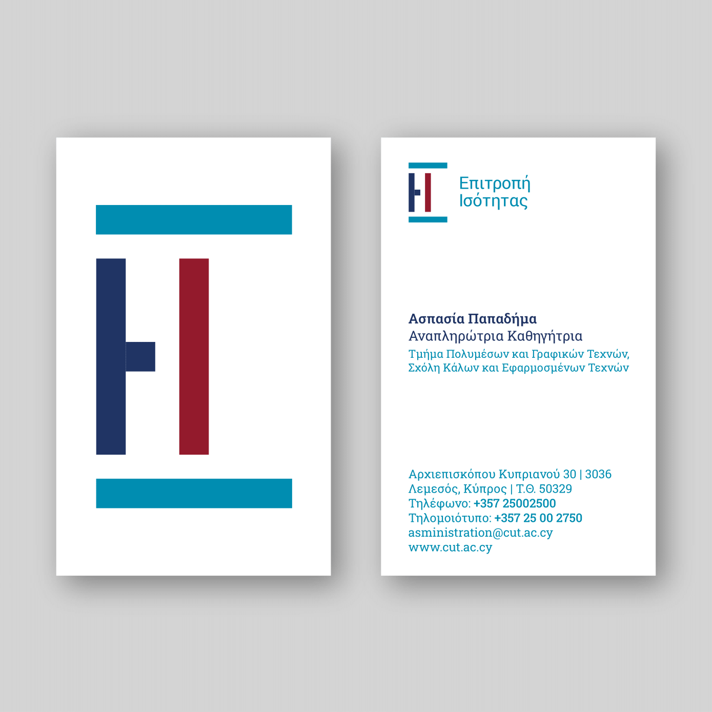
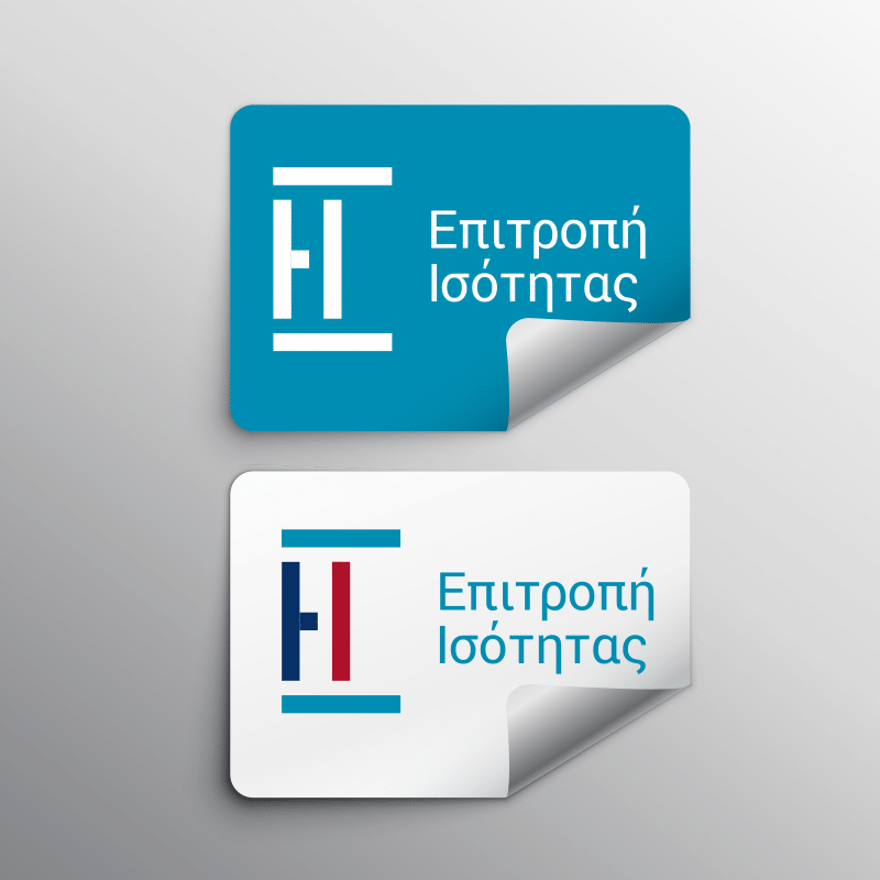
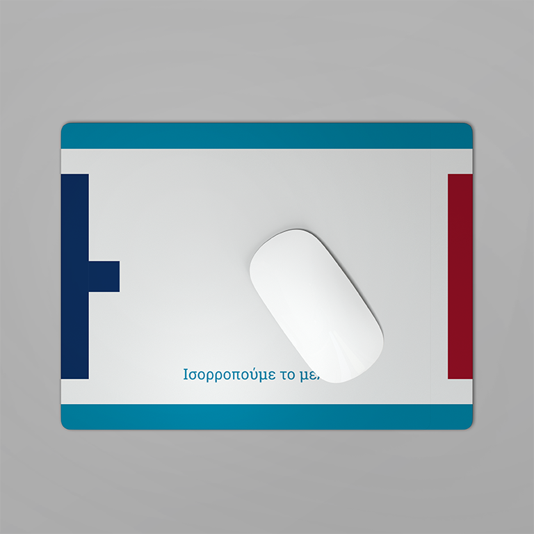
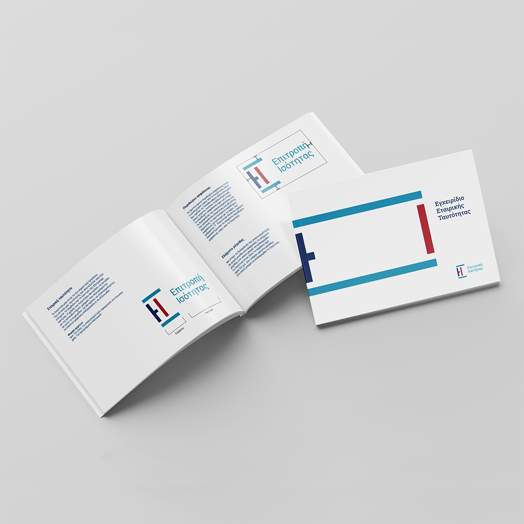
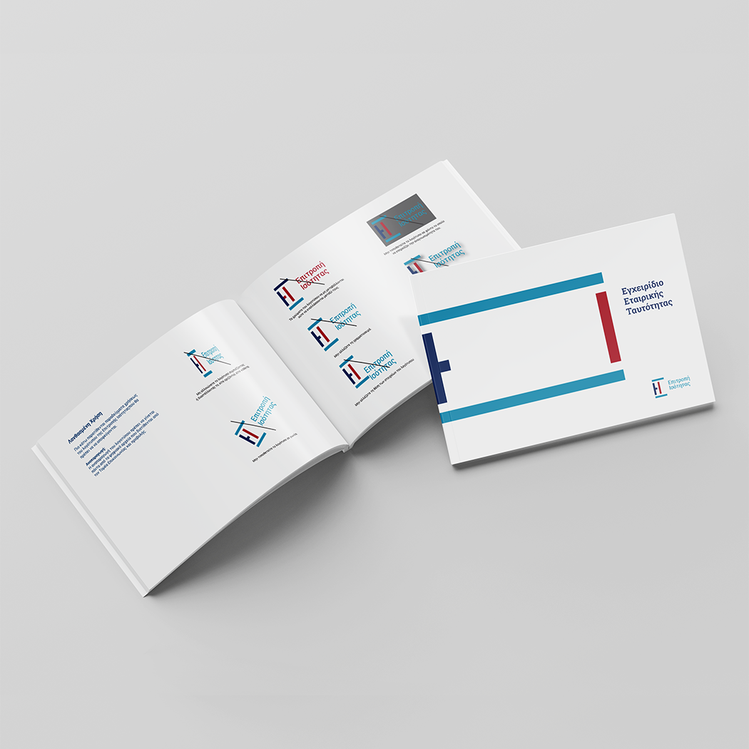
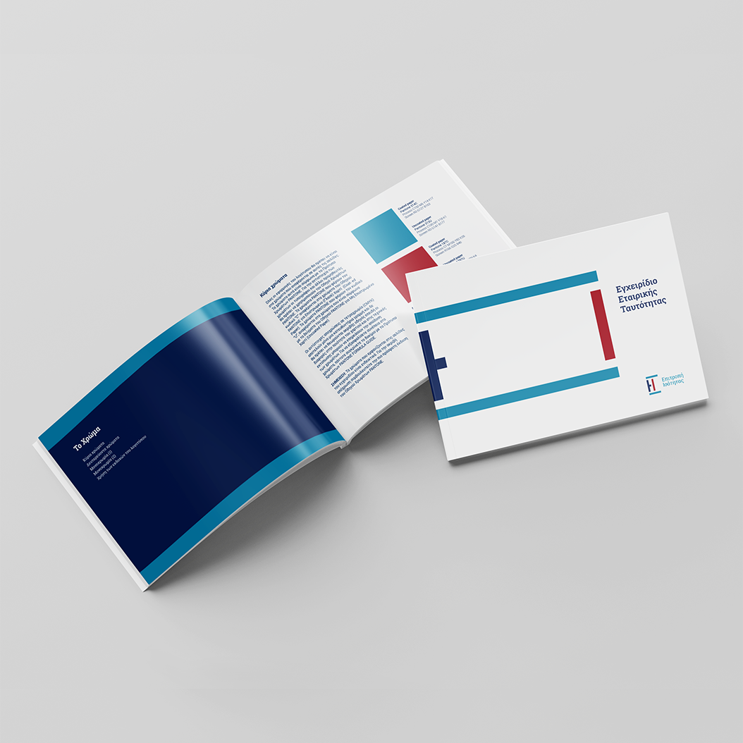
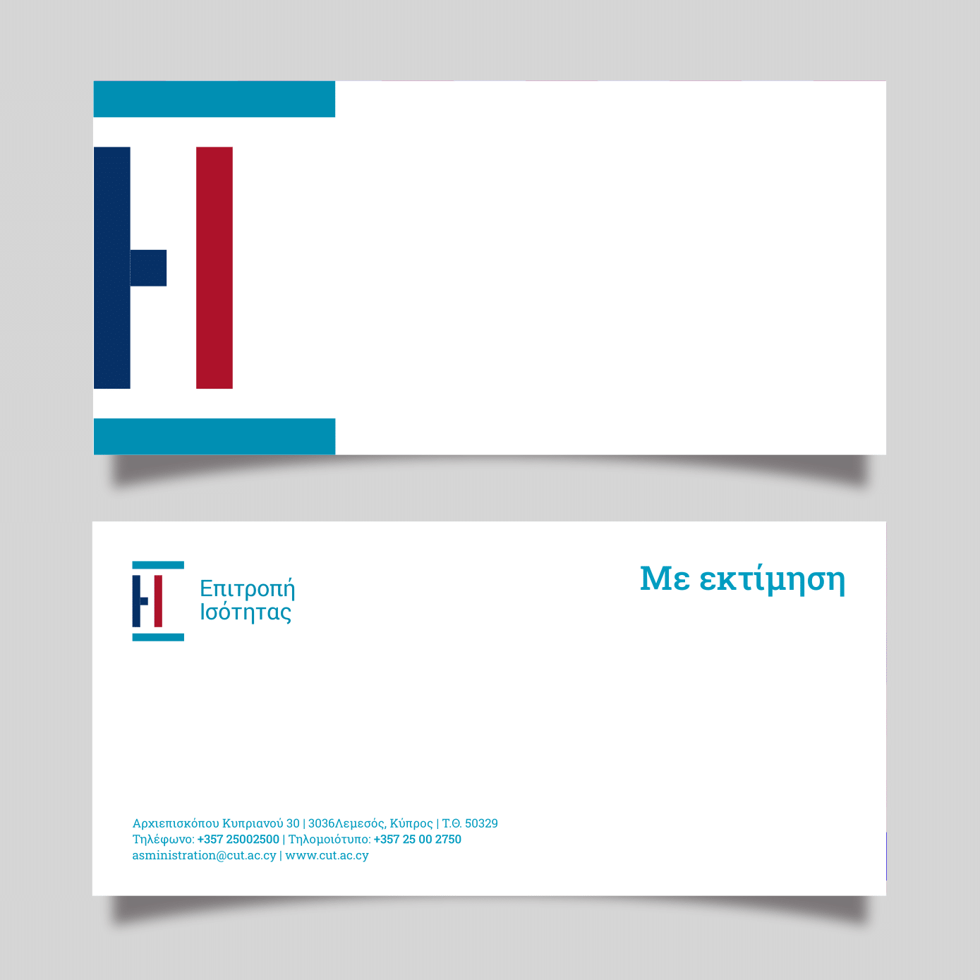
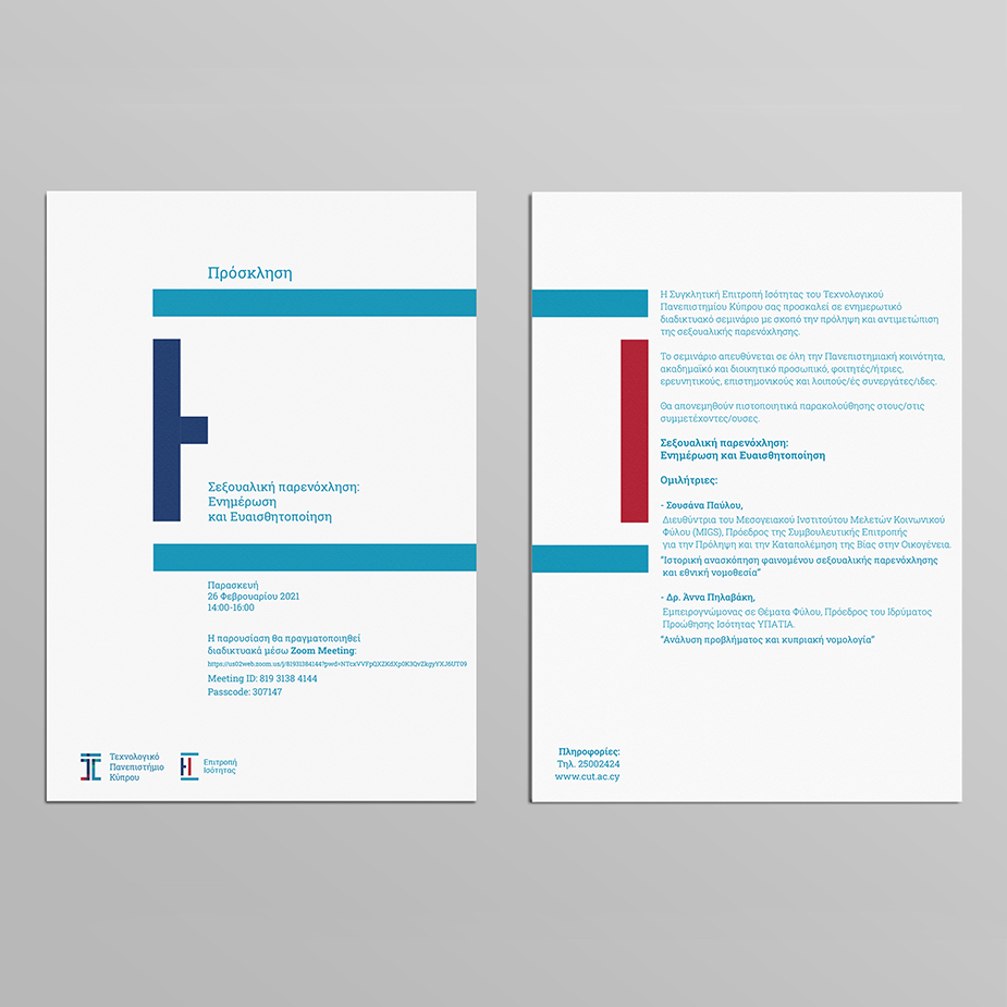
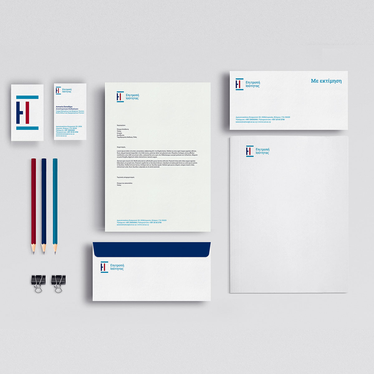
The Equality Commission logo is designed to inspire equality. Due to that, in its horizontal form, it shows a balanced seesaw, in the sense that in our society everything has to be balanced and no one to prevail against the other. In its vertical form, the two Greek initial letters E and I are appeared. The principles of the Gestalt method were also used, where they utilize the negative space so that the logo can be highlighted. The dark blue leaves a suspicion of a male figure and the dark red leaves a suspicion of a female figure, but these two figures are enclosed by two blue horizontal lines that express the equality that the two genders must have despite their differences. In addition, the Booklet Logo guides and all the related Stationeries such as Business Cards, with Compliment Card, Invitations, Advertising and more have been designed.