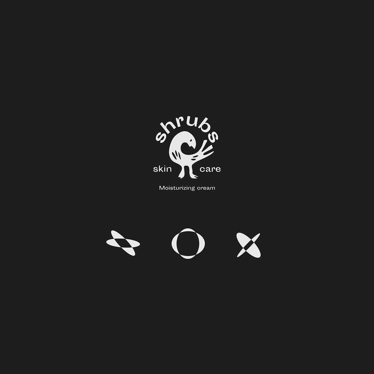
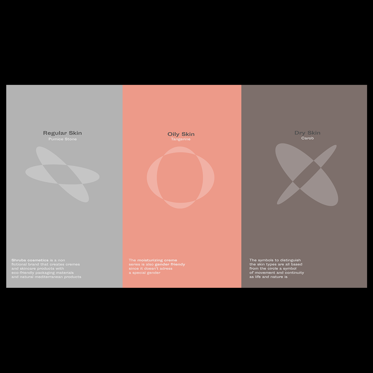
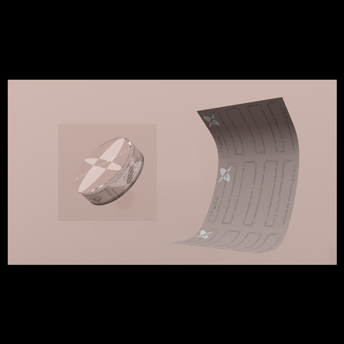
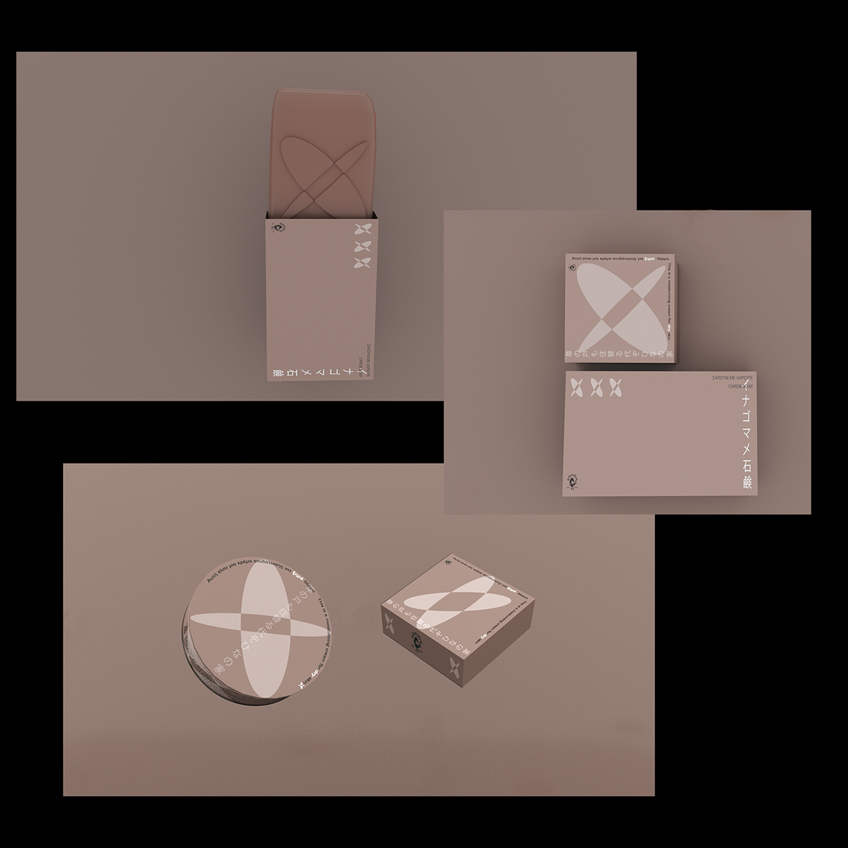
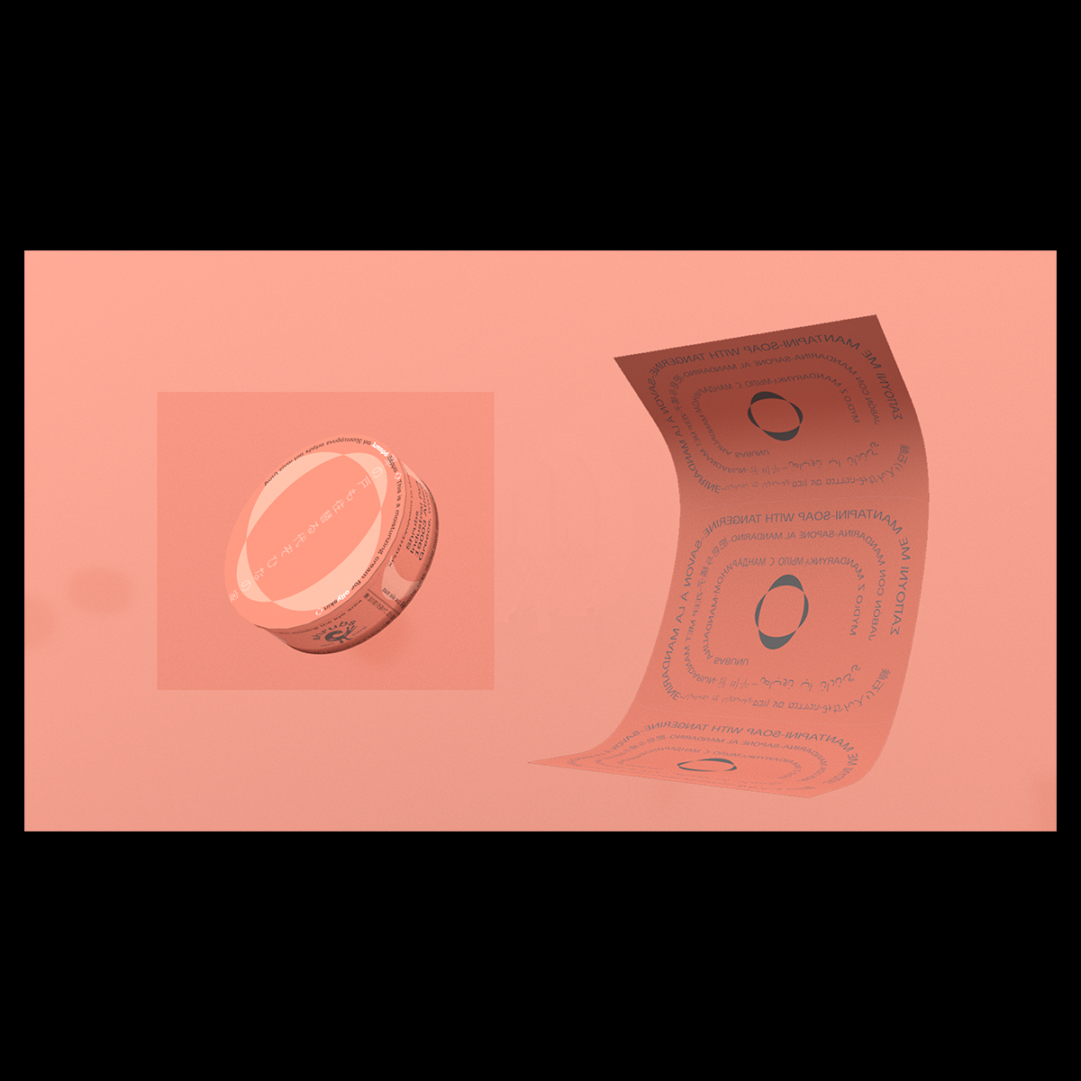
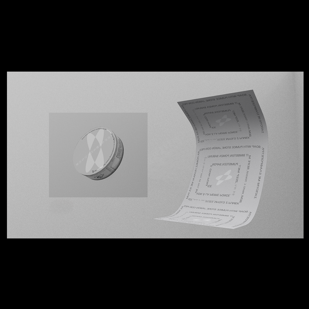
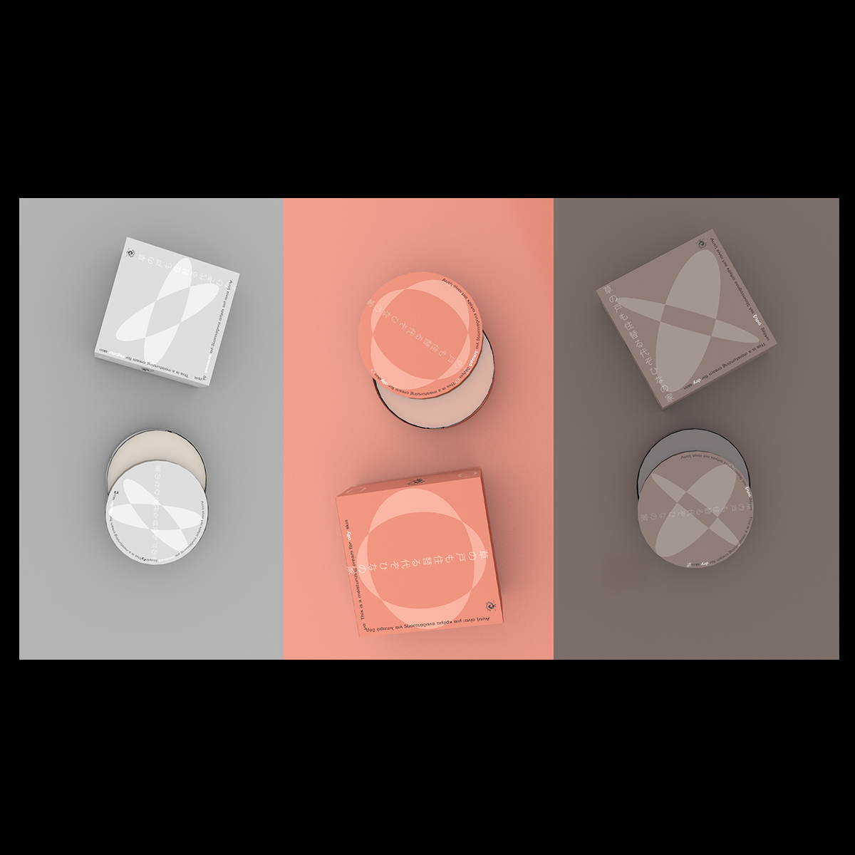
The brief given was to design the logo, the visual identity and the tea packaging for a Mediterranean company called Shrubs.
Shrubs is a company focused on the use of natural products and on the respect on the environment.
I decided to use linocut to give a more natural and unique look on the visual identity of the company and I decided to use the Ankofa bird as a symbol of the company because it’s a bird that turns and look behind/ looks and learn from the past, like the Shrubs company which uses natural techniques and products like our ancestors.
